I’m working on a colorscheme, that ambitions minimalism and a unique accent color, which could be personalized through a unique option.
Working with such a small palette, I’m using the dim attribute a lot.
I’m having an issue with how the bold attribute integrate when there is a dim value.
Explanations :
Here is a small snippet that reproduces the issue I’m having
face global PrimarySelection rgb:ffffff,rgb:212121+fg
face global SecondarySelection rgb:212121,rgb:ffffff+rdfg
face global keyword rgb:ff0000+bu
I’m using the revert + dim attribute with the SecondarySelection so the background (in foreground position here) is first dimmed then reverted into its background position. This allows me to have a dim version of the background color without having to use any extra color.
It might look stupid and using another color would be easier, but by doing this trick, the theme can be heavily modified with a single option change.
My issue comes with the bold attribute that “suppresses” the dim attribute.
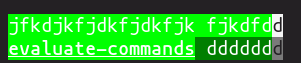
Above, you can see that secondary selection does not work over a keyword.
I know I could fix my issue my adding +F to both Primary and Secondary selection, but I just wondered if there might be another way that won’t change the way everything looks when selected (since using F prevent any other attributes while in selection, which is not what I would like)
Thanks in advance, don’t know if I’m really clear ahah, sorry !